

During my time at Ann Summers as a graphic designer, I had the opportunity to work on a wide range of creative projects that challenged and expanded my skill set. I was responsible for designing digital assets, promotional materials and visual elements across multiple channels, including Ecom, Paid Social, Email, Social Media and Direct Selling. One of my key projects was leading the rebrand of Ann Summers Sisterhood, where I modernised the brand’s visual identity while preserving its core values.
My role also involved collaborating closely with various teams to ensure that the designs were both visually compelling and aligned with the brand’s marketing strategies. From creating engaging visuals for product launches to developing cohesive designs for promotional campaigns, I was able to adapt my work to fit different platforms and audiences.
This experience allowed me to refine my skills in typography, layout, colour theory and digital design, all whilst contributing to the success of a well-known, forward-thinking brand.

Ann Summers 360
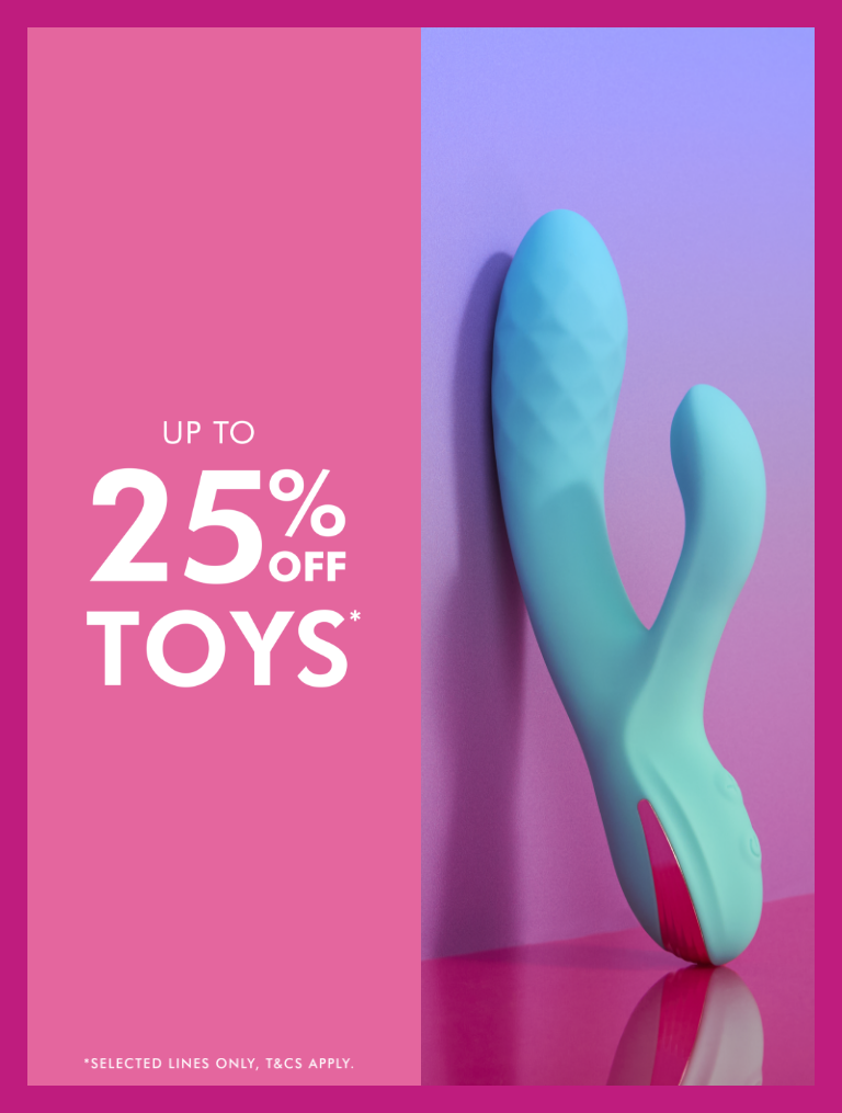
360s were a key part of the design process at Ann Summers. These 360 campaigns were created for new product launches, promotions and major social events that required wide visibility. I covered all channels including Ecom, Paid Social, Affiliates, Display, CRM, Social, Connect, Till Screens, Compliance and People & Talent.
Through this role, I learned how to efficiently produce a large volume of work with quick turnarounds, as we often had just one day to complete a full 360 campaign.


360 Example


Emails


Web Assets


Amazon Icons


Knickerbox was another brand I enjoyed working on. I contributed to designing assets for the launch of Ann Summers new company. This was a great opportunity to explore a new brand identity and create designs that followed different brand guidelines and color schemes. I was also involved in the design process for the new Instagram layout.


Booklets
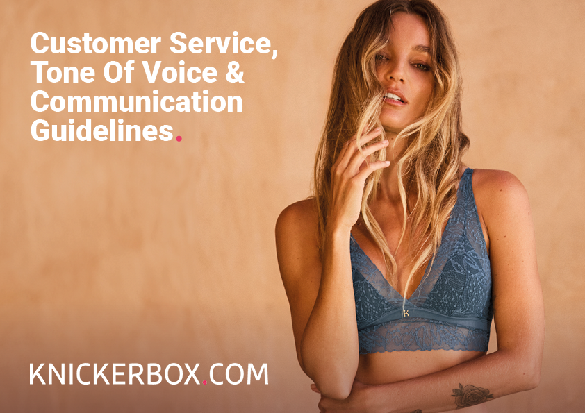
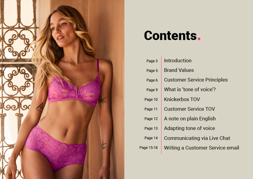
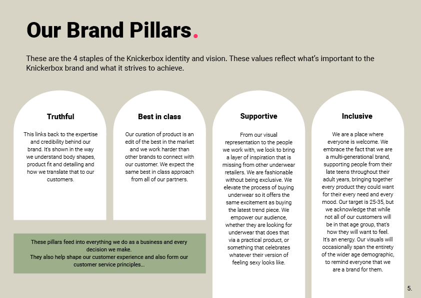
Below are a few pages extracted from one of the customer service books I designed. These pages showcase my use of layout composition, typography hierarchy and visual balance to create a clear and engaging user experience. Each element was carefully designed to ensure readability and alignment with the brand’s visual identity.


Social Media Backgrounds


